Brands have been historically used to mark property and identify ownership. In today’s competitive economy, your brand says a lot more about your business than just what’s your’s.
A brand is more than a logo, though most often identified by one. It represents an aspiration of how you want to be perceived in the marketplace. It may also be an understood promise to your customers. Each experience has with your brand either builds and reinforces that message, or undermines it.
A clever logo alone doesn’t establish your brand, but an insightfully strategic approach towards research, purposeful messaging and differentiating design can help elevate and build it.
I developed an in-system, sub-brand identity strategy for providing consistent labeling within First American’s primary brand, while not competing with or undermining it. The secondary corporate font is Avenir LT STD. Various weights and cap configurations were combined to create a uniform identification method for internal groups, projects, products and platforms. The aim of this tier one approach was to simplify the production of standardized word marks without creating badges that were too unique within the First American brand system.
Model

Variants


Fonts


Color Palette


Variants













Standalone Business Unit Identities


Standalone Podcast Identities



There were rare circumstances due to M&A activity that required the creation of unique cobranded logos. These were developed to be related to First American’s primary brand but allowed for retention of legacy equitable elements. Other factors that affect new identity creation include: target market, unique business proposition, and the organization purpose relative to the parent brand. The docutech logo below went through 3 primary revision phases, pre-M&A, transitional and final. On route to the final logo, over 40 transitional logos were considered, but the traditional candidate was selected. The business later changed its mind and wanted to return to an adapted legacy version. The original docutech font was similar to First American’s corporate font, Avenir LT STD, but wasn’t a complete match. It was geometric with rounded terminal strokes. In attempt to bridge the old/modern with the new/traditional, Avenir was redrawn to be a literal hybrid of the two styles.
Pre-M&A Original

Transitional


Final Logo

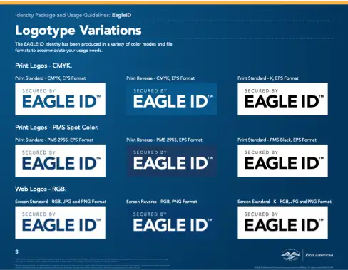
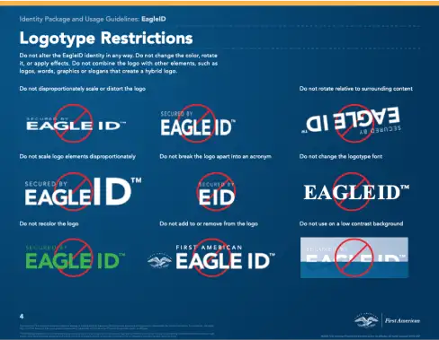
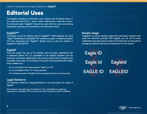
Each new mark, badge and logo are rolled out with a complete logo suite for print and web. Style and usage guides are also included for reference.
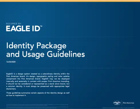
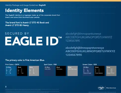
Primary Identity

Seconday Identity

System Additions

Fonts


Color Palette


Primary Identity
Alternatives


System Additions

Fonts

Color Palette


Primary Identity
Secondary Identities


System Additions

Fonts

Color Palette


Primary Identity

Secondary Identities


Fonts


Color Palette


